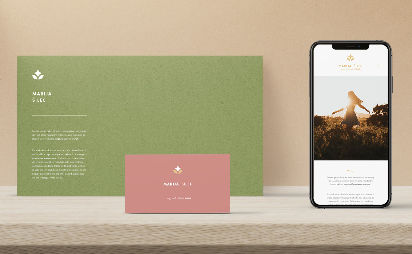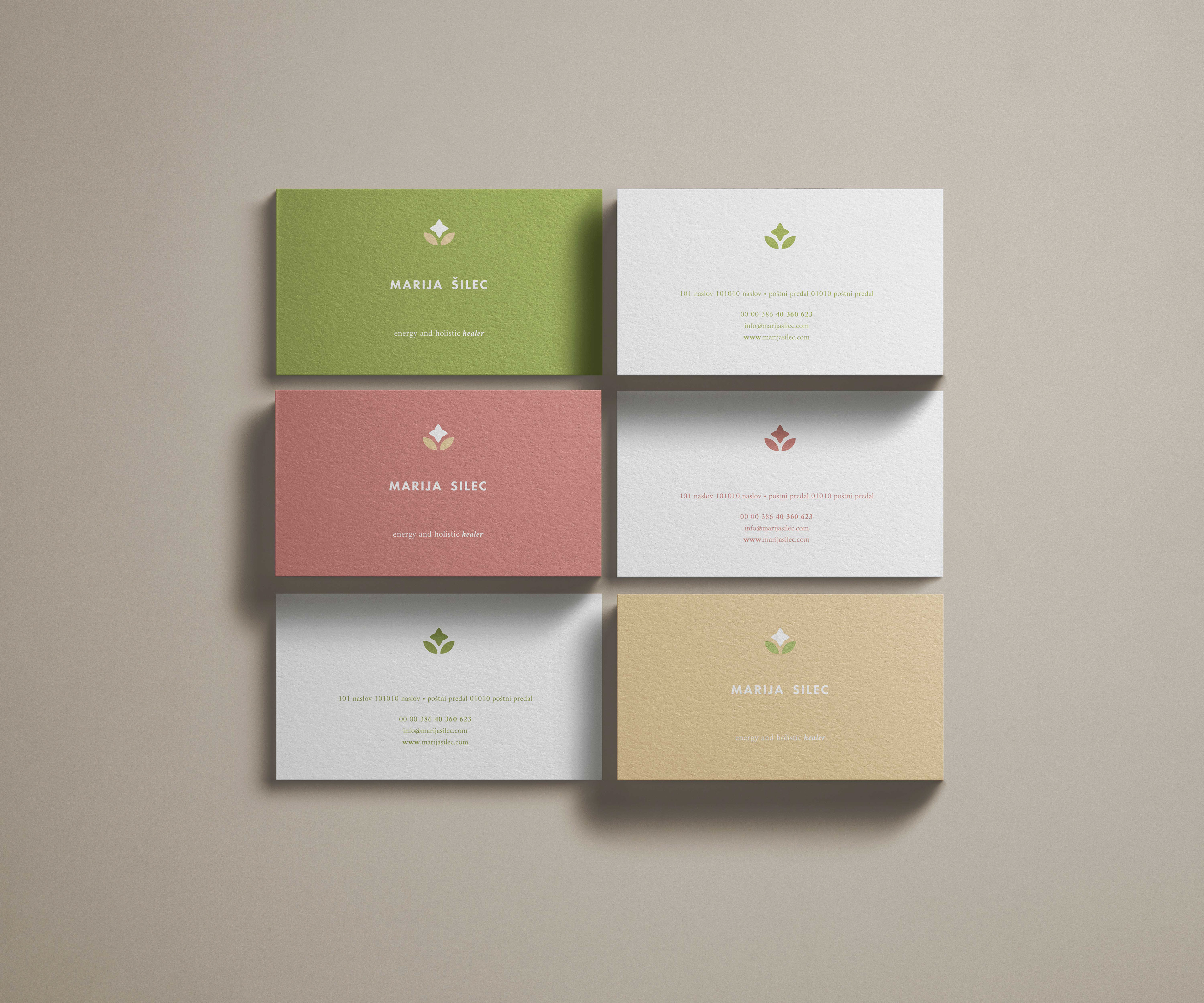

Ta celostna podoba je bila zasnovana za mojo sestro, ki se ukvarja s energijskim zdravljenjem in podporo pri holističnem načinu življenja. Toplota, radost, pomirjenost in intuicija so močne lastnosti njene osebnosti, obenem pa - si upam trditi - tiste kvalitete, zaradi katerih ji klienti zaupajo.
Vodilo pri oblikovanju je bilo, da podoba odraža ravno to. Da tisti, ki je še ne poznajo, to začutijo tudi preko njenih predstavitvenih vsebin na spletni strani in družbenih omrežjih.
Sam znak je zasnovan tako, da obenem ponazarja dva pomembna elementa, ki se prepletata v tem, kar počne; moč narave (ki jo poanazarja roža v znaku in barvna paleta, ki jo znak vsebuje) ter moč energije rok (znak obenem ponazarja tudi dlani, ki sta obrnjeni kvišku, od njiju k nebu pa potuje energija).
The given brand identity was designed for my sister who works with energy healing and holistic lifestyle support. Warmth, joy, calmness and intuition are strong traits of her personality, and at the same time - I dare say - the qualities that make clients trust her.
The guiding principle in the design was that the brand image reflects exactly this. So that those who do not know her yet can also feel it through her presentation content on the website and social networks.
The sign itself is designed to simultaneously illustrate two important elements that are intertwined in what she does; the power of nature (which is illustrated by the flower in the sign and the color palette that the sign contains) and the power of the energy of the hands (the sign also illustrates the palms facing upwards, from which energy travels to the sky).